This time, I will take a closer look at the energy consumption and energy efficiency of European countries. Eurostat Database has a plethora of data on these topics, which can be downloaded for free. I use the programming language Python with Pandas to analyse the data and visualise the results as diagrams.
Primary energy consumption in Europe
Primary energy consumption measures the total energy demand of a country excluding all non-energy use of energy carriers (e.g. natural gas used not for combustion but for producing chemicals) (1). Data was retrieved from the Eurostat database and downloaded in csv format (2).As you can see in the following line chart showing the EU as a whole, there is a slight decrease in primary energy consumption in the course of the years 2005 to 2015. However, 2015 again shows an increase compared to 2014.
The following bar chart shows the primary energy consumption of individual European countries for the most recent year available (2015).
Share of renewable energy in Europe
Primary energy consumption itself doesn't say anything about the way the consumed energy is produced. To get an idea of how "clean" the consumed energy is I generated some graphs based on the Eurostat data: "Share of renewable energy in gross final energy consumption" (3).
The line chart above shows a shallow linear rise in the share of renewable energy from 2006 to 2015. Interestingly, there is no acceleration in growth of renewable energy share during the given period.
As you can see in the next bar chart, the biggest primary energy consumers in Europe (Germany, France, UK, etc.) have a comparatively small share of renewable energy in gross final energy consumption in 2015.
Primary energy consumption per capita in Europe
It's obvious that Europe's biggest primary energy consumers also seem to be countries with rather high productivity and a big population. Therefore, I think it makes sense to put the primary energy consumption in relation to the population and the gross domestic product.
To analyse the primary energy consumption per person, I combined the previously shown data with the Eurostat data on population of European countries (4).
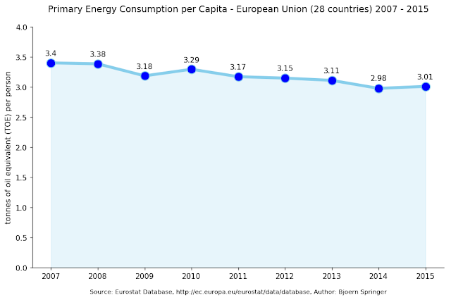
The graph on primary energy consumption per capita in the EU above shows a downward trend very similar to the absolute energy consuption in the EU (see first graph). As you can see, every EU citizen consumed about three tonnes of oil equivalent in 2015.
However, if you take a look at individual countries in 2015 (see below), there is a big difference to the absolute values on primary energy consumption: Europe's biggest primary energy consumers per capita are rather small countries like Iceland or Luxembourg. Countries with a big population and high GDP tend to be found in the mid-range.
However, if you take a look at individual countries in 2015 (see below), there is a big difference to the absolute values on primary energy consumption: Europe's biggest primary energy consumers per capita are rather small countries like Iceland or Luxembourg. Countries with a big population and high GDP tend to be found in the mid-range.
Energy intensity in Europe
A second approach would be to relate primary energy consumption to the gross domestic product (GDP). For this purpose I combined the previously shown data on energy consumption with the Eurostat data on gross domestic products of European countries (5).
Energy consumption in relation to GDP is called energy intensity. According to Wikipedia, "energy intensity is a measure of the energy efficiency of a nation's economy. It's calculated as units of energy per units of GDP." (6)
As you can see in the next bar chart, some of the countries with the highest primary energy consumption in Europe (UK, Italy, Germany) have a comparatively low energy intensity.
Data Visualisation
As in my last post, all raw data was retrieved in the form of csv-files from the respective websites. All graphs were made in Python with the modules Matplotlib, Seaborn and Pandas.Using Python in combination with pandas is a great way to analyse and edit raw data and combine rdata frames in new ways. With Matplotlib and Seaborn you can visualize the edited data according to your requirements.
If you are interested in how I generated the diagrams in detail, you can view the code that I wrote to analyse energy consumption per capita as a Jupyter notebook here.
References
(1) Primary Energy Consumption, Eurostat Database. Retrieved 21 January 2018.(2) ibid.
(3) Share of renewable energy in gross final energy consumption by sector, Eurostat Database. Retrieved 21 January 2018.
(4) Population on 1 January by age and sex , Eurostat Database. Retrieved 21 January 2018.
(4) GDP and main components , Eurostat Database. Retrieved 21 January 2018.


