Sunday 11 February 2018

Interior Facade Insulation for Air-Conditioned Buildings in Tropical Climates - Energy Simulation using 'Ladybug Tools'

One of the principles in building physics is to apply thermal insulation always on the 'cold side' of facades. That is why most buildings in cold or temperate climates have exterior thermal insulation. The same principle should apply to air-conditioned buildings in hot climates, in this case with thermal insulation on the inner side of the facades...


To examine the effects of interior thermal insulation, I made a building energy simulation of a simple office building floor located in a hot-humid climate using 'Ladybug Tools' software.


Location

As mentioned in one of my previous posts, buildings in hot-humid climates near the equator present a challenge regarding energy-efficient concepts. For this reason, I chose Jakarta which has a hot-humid, more precisely a tropical monsoon climate (Am) according to the Köppen climate classification. Hot-humid climates are characterised by mostly overcast skies, high humidity and frequent rainfall. Air temperature is always high with minimal daily and seasonal fluctuations.

Model

The building model which served as the base for the energy simulation was made in Rhino 3D. I tried to keep the model as simple as possible. The basic parameters of the model are:
  • dimensions: plan 6m x 8m, storey height 3,5m, 48m², 168m³, representing one thermal zone
  • windows: lowE windows in south and north facade, south window with permanent horizontal shading device, U-value: 1.3 W/(m²K), SHGC: 0.3, VT: 0.64
  • materials: 16cm concrete exterior walls at all for sides, concrete slabs connecting to upper and lower storey with identical thermal conditions
  • insulation: mineral insulating board, conductivity 0.045 W/(mK), thickness between 20mm and 100mm
  • thermal mass: 10m² of 16cm thick concrete wall
  •  program: air-conditioned open office use with default schedules and internal loads as provided by EnergyPlus
  • no natural ventilation

Screen shot of the Rhino model serving as a base for the energy simulation

Building energy simulation

The building energy simulation was made with 'Ladybug', a plug in for Grasshopper, the graphical algorithm editor for Rhino 3D. Ladybug in turn uses EnergyPlus as calculation engine and some other programs for it's building energy simulations. The good thing about these programs is that they are all for free, except for Rhino 3D which can be used for free during a 90-day trial period. The following illustration shows the Grasshopper canvas (i.e. the graphical algorithm representation) of this simulation.

Grasshopper canvas of the energy simulation
The grasshopper file can be downloaded here.

In this simulation , the annual amount of cooling Energy in kWh/a was calculated. In total there were six simulation runs with different facade constructions:
  1. 16mm concrete walls, no thermal insulation
  2. 16mm concrete walls with internal insulation, thickness: 20mm
  3. 16mm concrete walls with internal insulation, thickness: 40mm
  4. 16mm concrete walls with internal insulation, thickness: 60mm
  5. 16mm concrete walls with internal insulation, thickness: 80mm
  6. 16mm concrete walls with internal insulation, thickness: 100mm  
     

Results

Ladybug provides various tools to graph the simulation results. The following illustration is a 3-dimensional graph of the annual cooling energy for ideal air loads of the air-conditioned building without thermal insulation.

Annual cooling energy - exterior walls without insulation
Due to the climate zone, the cooling loads are similarly high throughout the year with no seasonal differences. The daily cooling is characterised by low loads at night/early morning and high loads during office hours. The hourly cooling loads have their peaks at around 4 PM with up to 5,5 kW.

By adding a layer of thermal insulation at the interior of the facade concrete walls the cooling loads can be significantly reduced. The next graph shows the annual cooling loads of the same building, this time with 40mm interior insulation. In this case, the hourly cooling loads rarely exceed 4kW.

Annual cooling energy - exterior walls with 40mm interior insulation
By combining the results of all six simulations in one line chart, the effect of internal thermal facade insulation of different thicknesses becomes more clear.


Conclusion

As shown in the above line chart, the annual cooling energy can be drastically reduced through the application of internal thermal facade insulation. In the present example, the annual cooling energy could be reduced by more than 20% by adding a 20mm thick thermal insulation layer. With a 40mm thick insulation layer the energy savings are more than 25%. 

Further increasing of insulation thickness has only a small effect on cooling energy savings.

Sunday 21 January 2018

Europe's Biggest Energy Consumers - Some More Data Analysis

This time, I will take a closer look at the energy consumption and energy efficiency of European countries. Eurostat Database has a plethora of data on these topics, which can be downloaded for free. I use the programming language Python with Pandas to analyse the data and visualise the results as diagrams.


Primary energy consumption in Europe

Primary energy consumption measures the total energy demand of a country excluding all non-energy use of energy carriers (e.g. natural gas used not for combustion but for producing chemicals) (1). Data was retrieved from the Eurostat database and downloaded in csv format (2).

As you can see in the following line chart showing the EU as a whole, there is a slight decrease in primary energy consumption in the course of the years 2005 to 2015. However, 2015 again shows an increase compared to 2014.

The following bar chart shows the primary energy consumption of individual European countries for the most recent year available (2015).


Share of renewable energy in Europe 

Primary energy consumption itself doesn't say anything about the way the consumed energy is produced. To get an idea of how "clean" the consumed energy is I generated some graphs based on the Eurostat data: "Share of renewable energy in gross final energy consumption" (3).


The line chart above shows a shallow linear rise in the share of renewable energy from 2006 to 2015. Interestingly, there is no acceleration in growth of renewable energy share during the given period.

As you can see in the next bar chart, the biggest primary energy consumers in Europe (Germany, France, UK, etc.) have a comparatively small share of renewable energy in gross final energy consumption in 2015.


Primary energy consumption per capita in Europe

It's obvious that Europe's biggest primary energy consumers also seem to be countries with rather high productivity and a big population. Therefore, I think it makes sense to put the primary energy consumption in relation to the population and the gross domestic product.

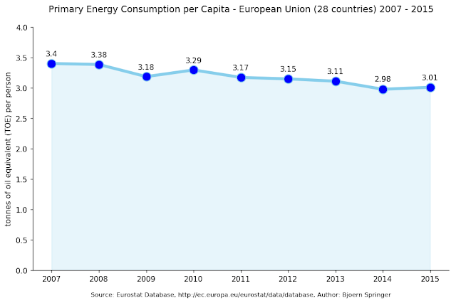
To analyse the primary energy consumption per person, I combined the previously shown data with the Eurostat data on population of European countries (4).


The graph on primary energy consumption per capita in the EU above shows a downward trend very similar to the absolute energy consuption in the EU (see first graph). As you can see, every EU citizen consumed about three tonnes of oil equivalent in 2015.

However, if you take a look at individual countries in 2015 (see below), there is a big difference to the absolute values on primary energy consumption: Europe's biggest primary energy consumers per capita are rather small countries like Iceland or Luxembourg. Countries with a big population and high GDP tend to be found in the mid-range.


Energy intensity in Europe

A second approach would be to relate primary energy consumption to the gross domestic product (GDP). For this purpose I combined the previously shown data on energy consumption with the Eurostat data on gross domestic products of European countries (5). 

Energy consumption in relation to GDP is called energy intensity. According to Wikipedia, "energy intensity is a measure of the energy efficiency of a nation's economy. It's calculated as units of energy per units of GDP." (6)


As you can see in the next bar chart, some of the countries with the highest primary energy consumption in Europe (UK, Italy, Germany) have a comparatively low energy intensity.

Data Visualisation

As in my last post, all raw data was retrieved in the form of csv-files from the respective websites. All graphs were made in Python with the modules Matplotlib, Seaborn and Pandas.

Using Python in combination with pandas is a great way to analyse and edit raw data and combine rdata frames in new ways. With Matplotlib and Seaborn you can visualize the edited data according to your requirements.

If you are interested in how I generated the diagrams in detail, you can view the code that I wrote to analyse energy consumption per capita as a Jupyter notebook here.


 References

(1) Primary Energy Consumption, Eurostat Database. Retrieved 21 January 2018.
(2) ibid.
(4) GDP and main components , Eurostat Database. Retrieved 21 January 2018. 
(6) Energy Inensity, Wikipedia. Retrieved 21 January 2018.


Monday 1 January 2018

Key Factors of Global Energy Consumption - Data Analysis with Python

Buildings account for a large portion of global energy consumption. The future development of global energy consumption depends on three key factors: population increase, economic development and energy intensity (1). In this post, i am going to visualise publicly available raw data related to these key factors with diagrams made in python with matplotlib.


Global population increase until 2015

World population data was retrieved from the United Nations world population prospects website. The available data covers the years 1950 to 2100. The first chart is a stacked area chart showing the population of the all world regions until 2015.

 
To show the differences in population development of the separate regions more clearly, I plotted the same data as a multiple chart. 


Global population increase, future development

The figures from 1950 to 2015 are estimates, the figures after 2015 are projections based on the 'medium fertility variant'. The red dashed line shows the year 2015 representing the separation between estimates and projections.

This multiple chart shows the population separately for each region. Again, the raw data is the same like in the graph above.


Global economic growth

The following diagram shows the average annual GDP growth per capita and by country for the last five years (2011 - 2016). The raw data was retrieved from the World Bank Data Bank. Countries with dark purple colours have the highest GDP growth.

https://drive.google.com/open?id=1LYzGTUAC7QgNfyOIdxlu42OdrVhNvLZX

This is a screen shot of the original svg-file that can be downloaded here. The svg-file is interactive and shows the GDP growth figures of each separate country.

Global primary energy consumption

The most comprehensive data on primary energy consumption by regions I could find was the BP Statistical Review of World Energy 2016.  It covers the years 1965 to 2015. Unfortunately, the classification by regions is slightly different from the previous graphs. Note that this data includes only commercially-traded fuels (coal, oil, gas), nuclear and modern renewables used in electricity production. As such, it does not include traditional biomass sources. Unfortunately, the classification into regions doesn't correspond exactly to the one used for the data on population growth.

Next, you can see the same data as a multiple chart showing the individual regions.

Data Visualisation

All raw data was retrieved in the form of csv-files from the respective websites. The interactive world map showing the GDP per capita growth 2011 - 2016 was made in Python with the Pygal module. All other graphs were made in Python with the modules Matplotlib, Seaborn and Pandas.


References

(1) cf. Daniels, Klaus; Hammann, Ralph E.: Energy Design for Tomorrow, S. 104